Featured case study
UTH Public Safety Dashboard
This is the project I'm proudest of. The UTH Public Safety Dashboard brings public data on violence, overdoses, poverty and food access into one place, so Under The Helmet Riders Foundation can look at five Illinois communities (Chicago, Rockford, Peoria, East St. Louis and Springfield) side by side, measured the same way.
I work with the foundation’s leadership, including Antaeus, on which datasets, features and public safety topics go into the dashboard. I handle the technical development.
- My role
- Technical development. Datasets, features and public safety topics are chosen together with UTH leadership, including Antaeus.
- Built with
- React
- Vite
- Leaflet
- Recharts
- OpenStreetMap
- Nginx
- Public datasets
- Links
- Open the dashboard (opens in a new tab)Requires authorized access
tracker.uthridersfoundation.org

The problem
Two crises, usually tracked in separate places
Violence and overdose deaths tend to get counted by different agencies, on different dashboards, for different audiences. But they show up in the same places, next to the same pressures: poverty, disinvestment, distance from basic things like a grocery store. Look at only one of them and the other disappears.
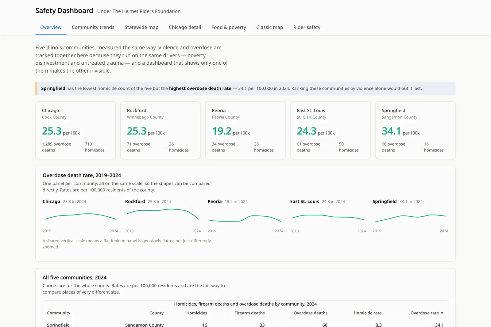
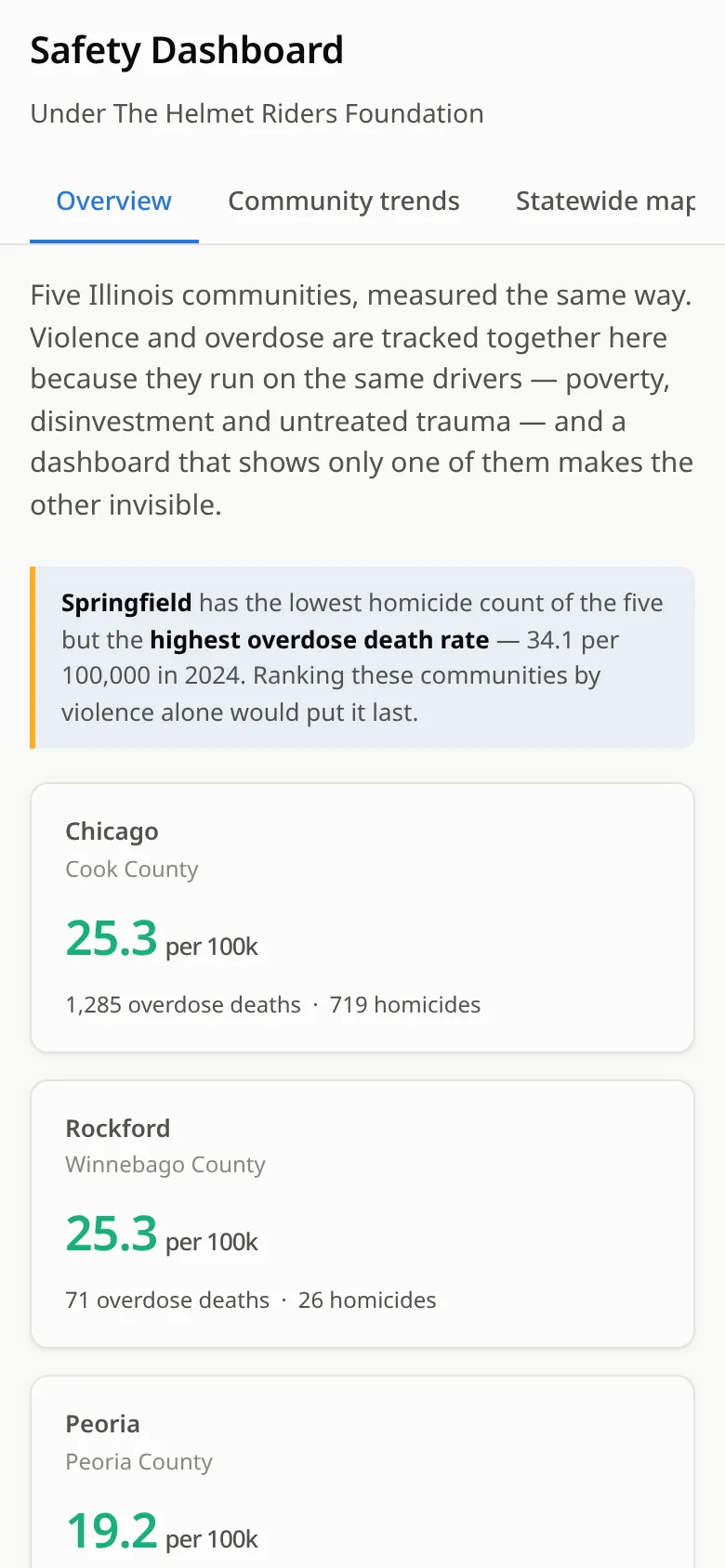
The dashboard’s own overview makes the point better than I can. Springfield has the lowest homicide count of the five communities, but the highest overdose death rate (34.1 per 100,000 in 2024). Rank the five by violence alone and Springfield looks like the safest place on the list.
The goal isn’t to prove what causes what. It’s to give the foundation, and the people it talks with, an honest shared picture of where these problems overlap.
Where it’s been used
A working tool, not an official one
The foundation uses the dashboard in its public safety work, and it has received interest in connection with Illinois public health planning discussions.
To be clear about what that means: it is not a government tool. The Illinois Department of Public Health (IDPH) and other agencies have not endorsed, adopted or partnered on it. It’s the foundation’s dashboard, built from public data.
My role
What I actually do on it
- Work with UTH leadership, including Antaeus, on which datasets, features and public safety topics go in.
- Find and combine the public datasets, and handle their quirks: county-level versus city-level figures, withheld small counts, partial years.
- Design and build the maps, charts, tables and the plain-language notes that explain them.
- Handle the technical side of running it, including keeping it behind a login.
How it’s built
AI-assisted, human-checked
I build this with AI coding assistants doing a lot of the typing. I’m upfront about that because it’s true, and because it’s how I learned to build software in the first place.
What I bring is the part the AI can’t: deciding what’s worth showing and how to show it fairly, planning the build with the foundation, testing every view, checking numbers against the source data, and pushing back when the AI is confidently wrong (which happens).
What’s in it
The dashboard is organized into seven views.
Overview
Five communities measured the same way: overdose death rates, homicide and overdose counts, small trend charts on a shared scale, and a sortable comparison table.
Community trends
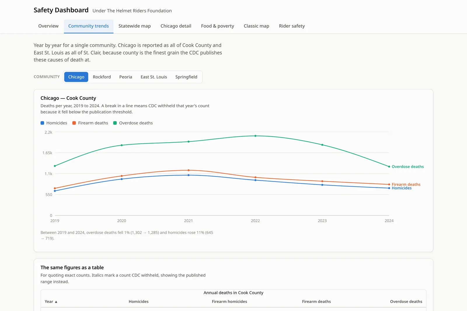
Year-by-year homicides, firearm deaths and overdose deaths (2019–2024) for one community at a time, with a plain-language summary of the change and the exact numbers in a table.
Statewide map
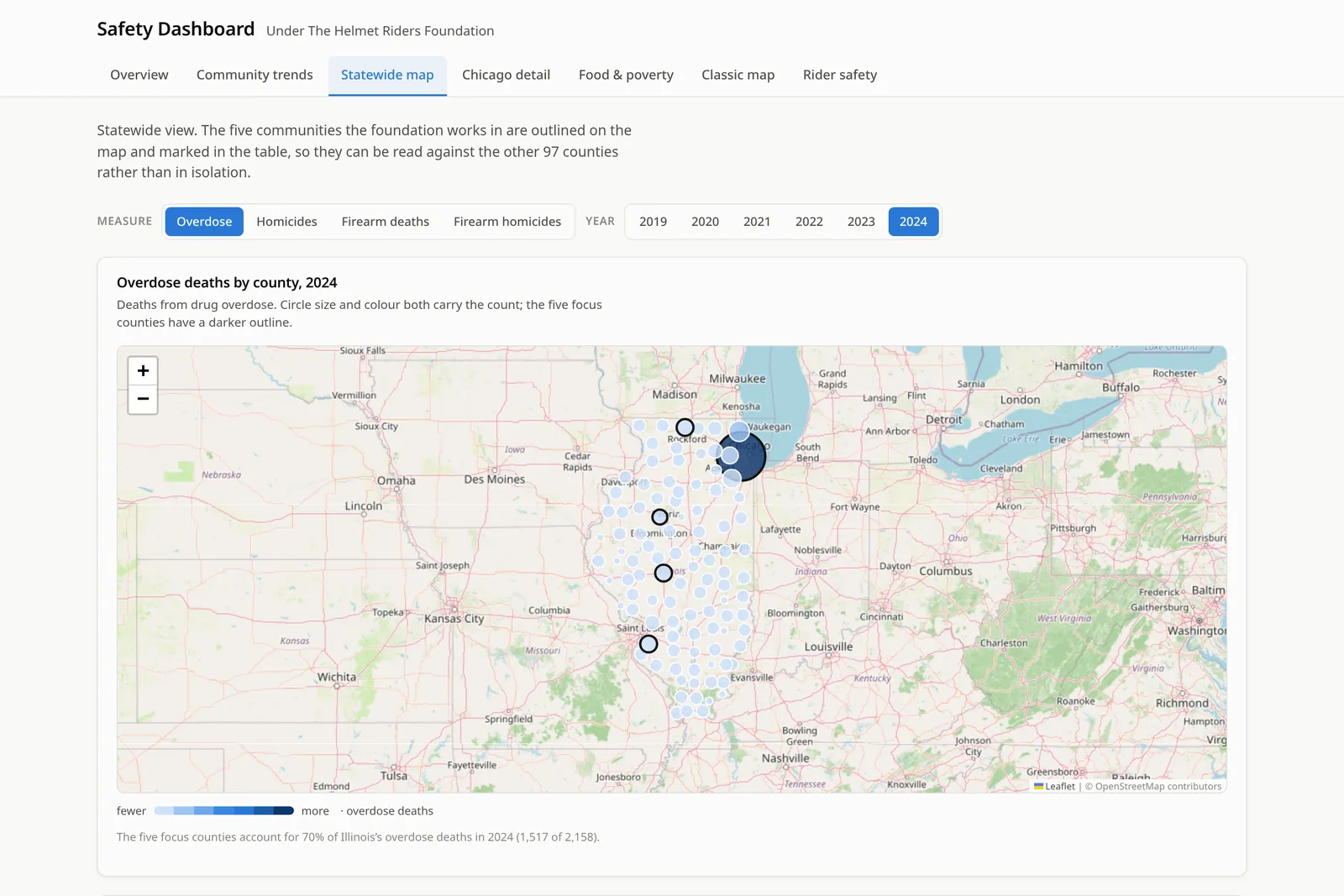
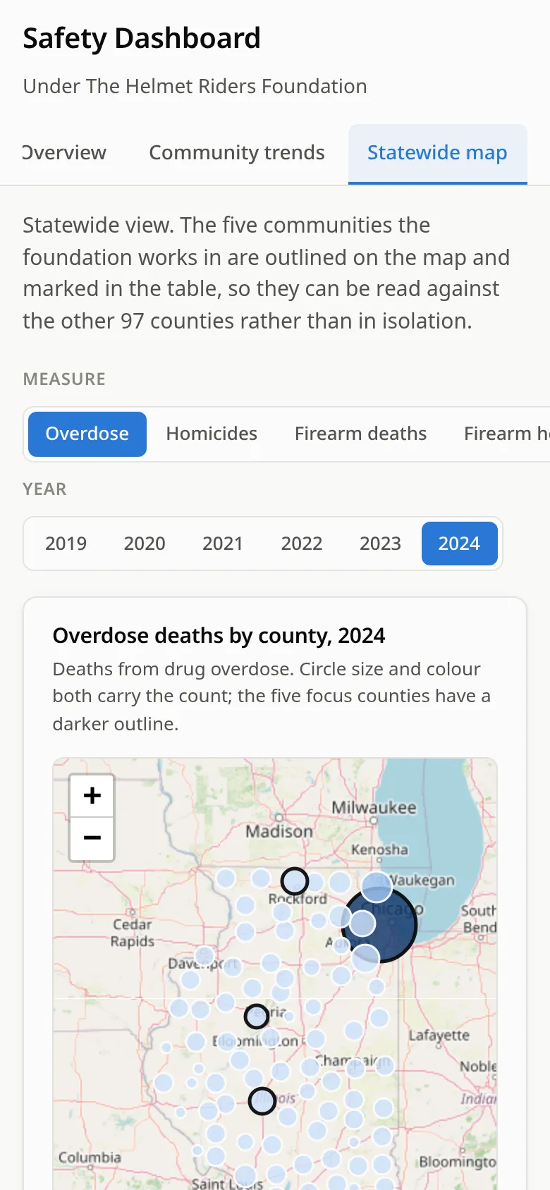
All 102 Illinois counties on an interactive map. Switch between overdoses, homicides, firearm deaths and firearm homicides, pick a year, and see the five focus counties against the rest.
Chicago detail
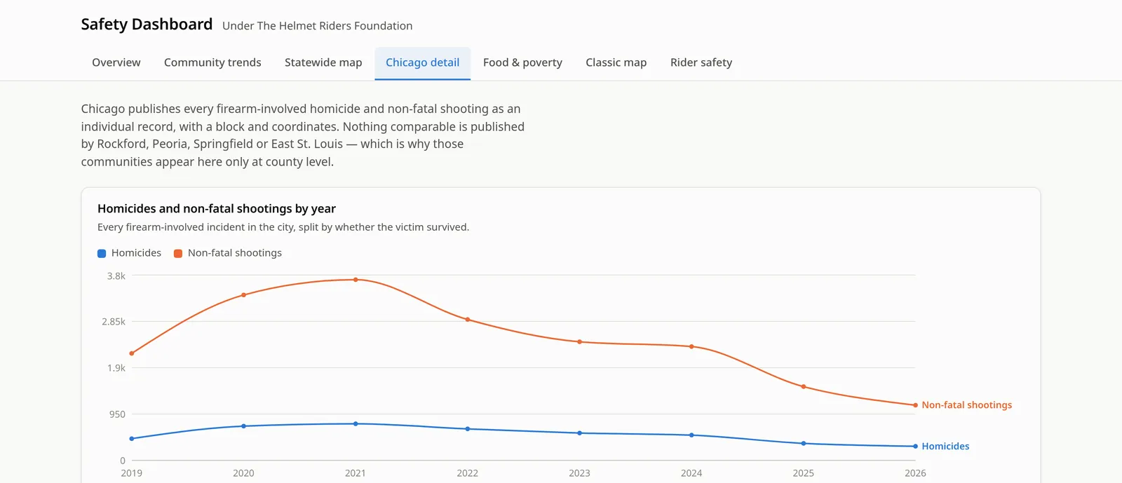
Chicago publishes firearm homicides and non-fatal shootings as individual records, so this view goes deeper: yearly trends, an incident map and the blocks with the most incidents.
Food & poverty
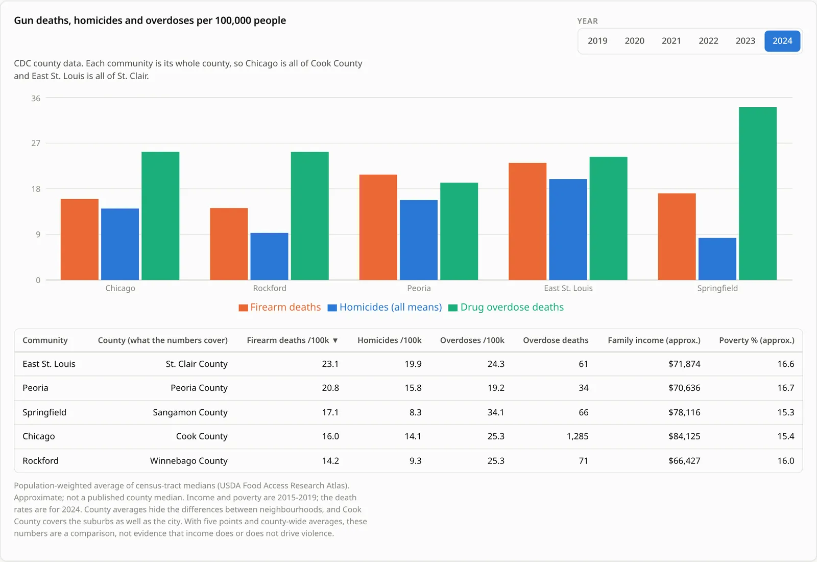
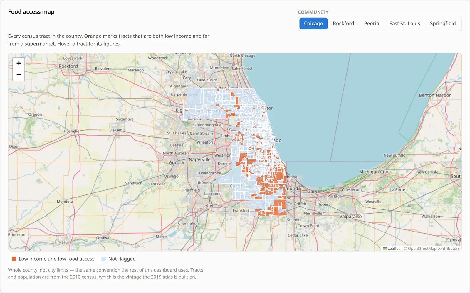
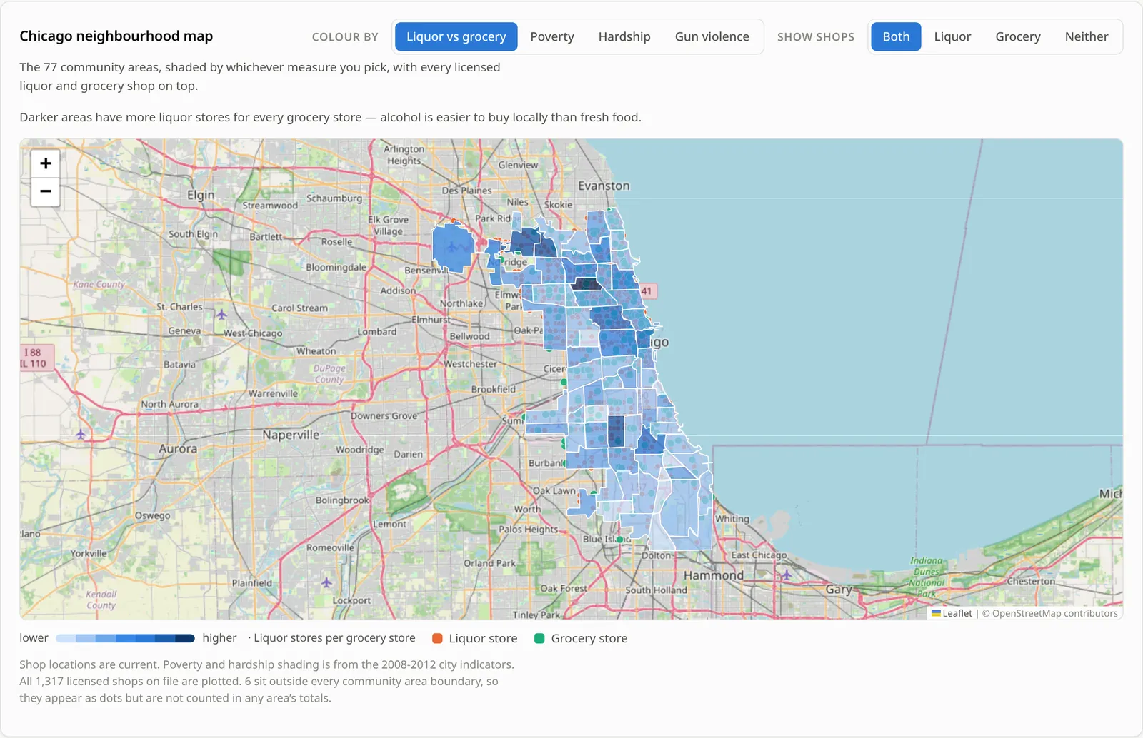
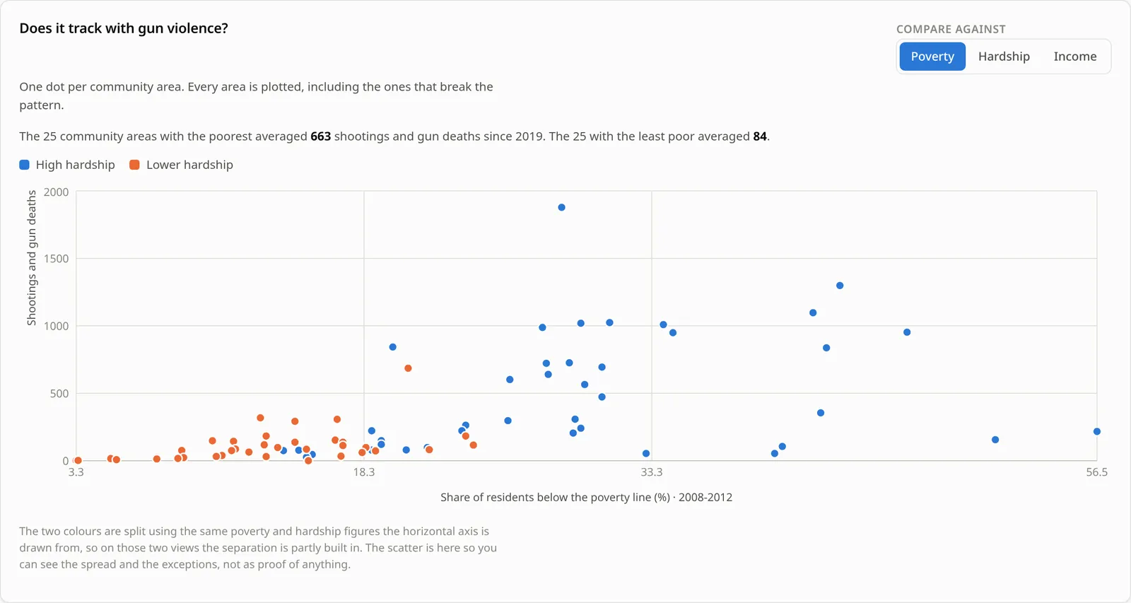
USDA food-access data by census tract for all five communities, plus a Chicago neighborhood map comparing liquor stores with grocery stores, poverty, hardship and gun violence.
Classic map
The original Chicago map and charts from an earlier version, brought back with opioid overdose deaths added, plus a per-100,000 comparison of all five communities.
Rider safety
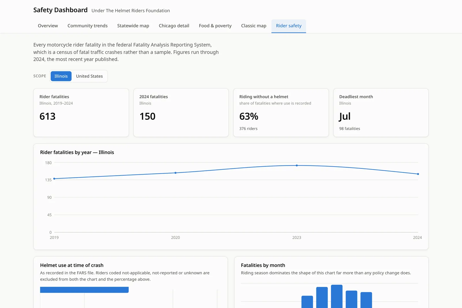
Motorcycle rider fatalities from the federal FARS data, for Illinois or the whole country, including helmet use and deaths by month. This is where the project started.
Honest by design
Charts come with table versions, withheld CDC counts show as ranges instead of zeros, partial years are flagged, and “before you quote these numbers” notes explain what each measure does and doesn’t mean.
Screenshots
Captured from the live dashboard in October 2026. The data shown is public; the dashboard itself sits behind a login.
Data sources
These are the sources named inside the dashboard itself.
- CDC: Mapping Injury, Overdose, and Violence (county data) (opens in a new tab)
- County counts and rates for homicides, firearm deaths and drug overdose deaths (dataset psx4-wq38).
- City of Chicago: firearm homicides and non-fatal shootings
- Chicago Police Department records published by the City of Chicago, one record per incident with block and coordinates.
- City of Chicago: business licences and community area indicators
- Current liquor and grocery store licences, plus the 2008–2012 hardship index, poverty and income figures by community area.
- Cook County Medical Examiner
- Opioid-related deaths since 2019, placed by where the person died or was found.
- USDA Food Access Research Atlas (2019) (opens in a new tab)
- Low-income, low-access census tracts, built on 2010 census tracts.
- NHTSA Fatality Analysis Reporting System (FARS)
- Motorcycle rider fatalities, through 2024.
- OpenStreetMap
- Base map tiles, displayed with Leaflet.
Limitations
Public data has gaps, and a dashboard that hides them isn’t doing anyone favors. These are spelled out in the dashboard too.
County, not city. CDC publishes these causes of death by county, so “Chicago” means all of Cook County (suburbs included) and “East St. Louis” means all of St. Clair County.
Small numbers get withheld. CDC suppresses counts below its publication threshold; the dashboard shows the published range instead of pretending it’s zero.
Different sources count different things. Medical Examiner opioid deaths and CDC drug overdose deaths won’t match. Firearm deaths include suicides; firearm homicides don’t.
Data vintages vary. Poverty and hardship figures are from 2008–2012, food access from the 2019 USDA atlas, and incident data is current. The most recent months are incomplete.
Only Chicago has incident-level data. Rockford, Peoria, Springfield and East St. Louis appear at county level, because that’s what’s published.
Busy years are sampled on the map. The Chicago incident map caps at 4,000 points per year so it stays usable in a browser.
Association isn’t cause. Poverty, food access, overdoses and violence cluster together. The dashboard can show where; it can’t tell you why.